Did you know that style guides are a great way to drive brand awareness?
My latest Periscope provides an introductory lesson on what a style guide is and why it’s important to develop one for your brand.
A style guide is essentially the vision for the visual look and feel of your brand.
A style guide:
- details the visual elements that will be used across all of your (on and offline) marketing efforts.
- drives the look of everything from your website, to your logo, to the individual images you create for your blog and social media posts.
- helps ensure brand consistency.
A basic style guide consists of a color palette, font usage guidelines, logos, and templates.
Your style guide will end up driving the look of your: logo placement, email communications, print flyers and digital advertisements.
So, where should you start?
Here are three elements that are a great start for your style guide:
- Color palette: A color palette is the first step. You’ll need to pick one main color, as well as a few accent colors to define your brand. The color palette will drive your brand imagery. Do you use a lot of bright colors? Or do you use a lot of white space? Those questions are answered through your style guide. Using colors from within your color palette consistently over time will allow your audience to develop a visual association between those colors and your brand.
- Ex: My main color is a green. White, black and grey are my accent colors.
- Fonts: The next step is to decide which fonts you’ll use. Pick at least two, then decide which fonts and sizes should be used for headlines vs. body copy. These font usage parameters will help serve as a baseline for how you structure your website, blog posts, email communications and social media imagery. Once you have the fonts, be sure to download them to your computer if they’re not already there. You’ll want to use them across all new proposals, white papers, etc.
- Ex: I have two fonts (Oswald and Lato) for online and print communications. I use those two, as well as another two, for all brand-centric imagery.
- Design templates: Now that you know the exact fonts, sizes and colors to use, you can create specific templates for each of your various email communications. When your email communication templates have a similar look and feel as your social media imagery, it helps your audience establish a connection with your brand. It also makes you look much more professional.
- Ex: I have a template for my monthly email communication. (You can sign up for my list here.)
Takeaway: It is worth investing time and energy in to creating a basic style guide. This document will drive the look and feel of your business, and you’ll want to refer to it whenever creating brand-centric communications or imagery.
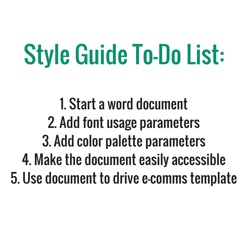
To do: Make a word document with your logo, color palette and hex codes, fonts and the usage parameters (headlines, body copy, exact sizes) for each font, detail font usage parameters for each of your various communications (email, website, print, imagery) and templates. Make this document easily accessible.
Tip: pick colors, fonts and templates that speak to the look and feel you are trying to establish for your brand. Color usage is important.
Remember: regardless of what look and feel you are trying to establish, consistency is key! If you want your audience to start to associate your brand with a specific color, use it repeatedly in your imagery and on your website!
Tools: For image creation and sizing, I like to use PicMonkey, Canva and Typorama (iOs app.)
Do you use any tools for your style guide?
Comment and share below!